The Meaning of Color in Graphic Design
Blog
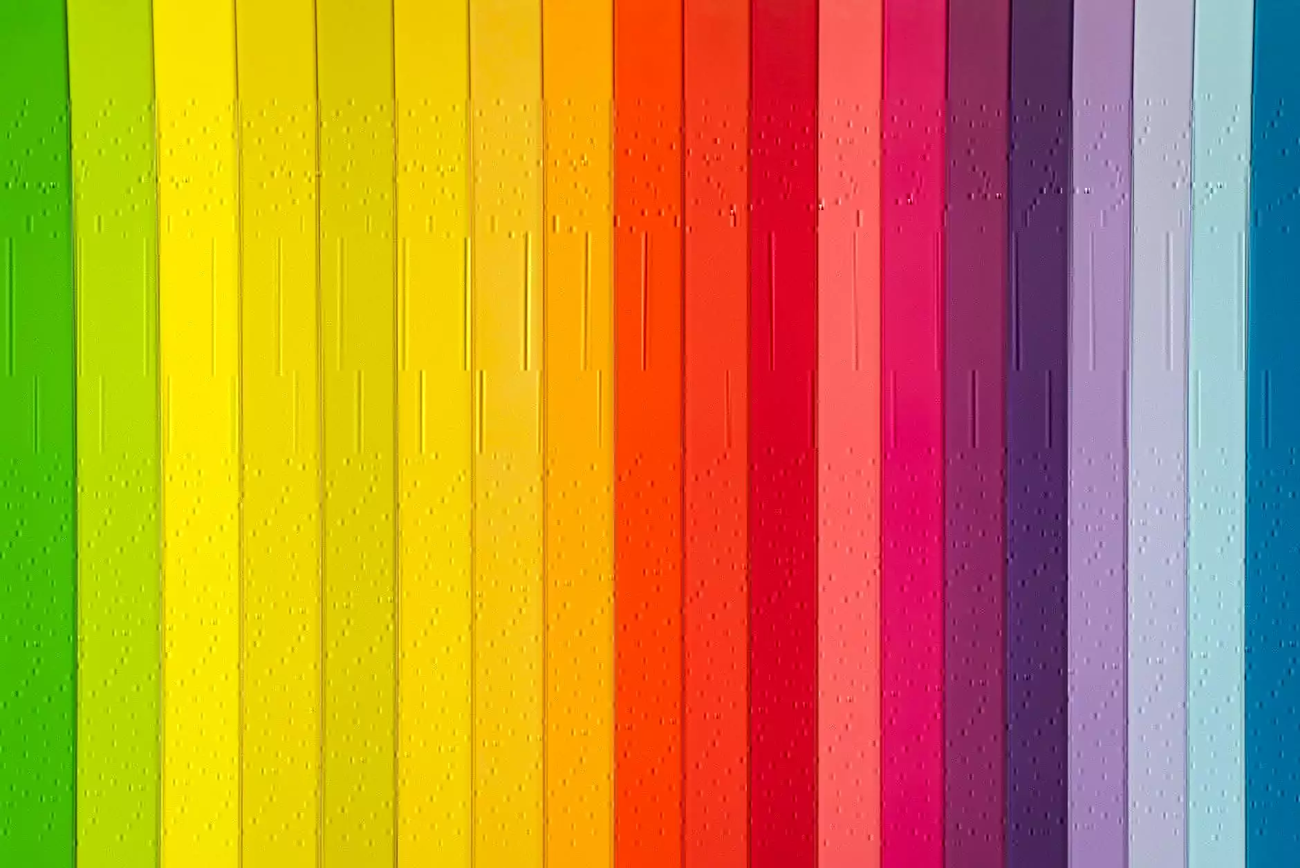
In the world of graphic design, color plays a crucial role in visual communication. Understanding the meaning behind different colors is a fundamental skill for graphic designers. Each color carries its own symbolism, cultural connotations, and psychological impact. As a leading provider of SEO services in the field of business and consumer services, Charlotte Seo is here to guide you through the fascinating world of color in graphic design.
The Psychology of Color
The exploration of color psychology is a vast area. Different colors evoke unique emotions and reactions in individuals, making them a powerful tool in design. Here, we'll delve into some of the most commonly used colors and their associated meanings:
Red: Captivating and Energetic
Red is a bold and attention-grabbing color commonly associated with power, passion, and excitement. It creates a sense of urgency and can stimulate strong emotions. In graphic design, red is often used to convey energy, importance, and urgency.
Blue: Trustworthy and Calming
Blue is often associated with trust, reliability, and tranquility. It has a calming effect on people and is frequently used in corporate designs to establish credibility and professionalism. Blue is also used in designs that aim to evoke a sense of serenity and peace.
Green: Freshness and Growth
Green symbolizes nature, growth, and freshness. It is often used to represent eco-friendly or sustainable concepts. In graphic design, green is utilized to convey a sense of balance, harmony, and renewal. It can also be associated with wealth and prosperity.
Yellow: Optimism and Warmth
Yellow is a vibrant and cheerful color that represents optimism, happiness, and warmth. It can grab attention and create a sense of positivity. When used in design, yellow can help evoke feelings of joy and energy.
Orange: Creativity and Enthusiasm
Orange is an energetic color that combines the passion of red with the vibrancy of yellow. It is often associated with creativity, enthusiasm, and youthfulness. In graphic design, orange is used to draw attention and promote a sense of vitality.
Purple: Royalty and Luxury
Purple has long been associated with royalty, luxury, and spirituality. It is a color that stimulates creativity and represents elegance and sophistication. In graphic design, purple is often used to convey a sense of opulence and exclusivity.
Black: Power and Sophistication
Black is a color of power, sophistication, and authority. It represents formality and elegance. In design, black is frequently used to create a sense of luxury, professionalism, and exclusivity. It can also be utilized as a neutral backdrop to highlight other colors.
White: Purity and Simplicity
White symbolizes purity, simplicity, and cleanliness. It is often associated with innocence and represents a blank canvas for design. In graphic design, white is used to create a sense of spaciousness, simplicity, and elegance. It can also enhance readability and promote a minimalist aesthetic.
Conclusion
Understanding the meaning of color in graphic design is essential for effective visual communication. As an expert in the field of SEO services, Charlotte Seo aims to empower businesses and graphic designers with the knowledge needed to create impactful designs. Whether you are looking to evoke certain emotions, establish credibility, or convey specific messages, incorporating the right colors into your designs can make a significant difference. Take a step further and explore the captivating world of color in graphic design with Charlotte Seo.
Contact Charlotte Seo today for professional SEO services tailored to your business in the field of graphic design. Let us help you optimize your website and content to outrank your competitors and attract a wider audience. Together, we can elevate your online presence and maximize your potential in the world of graphic design.


